When you’ve a product, you’ve a bunch of features that solve specific use-cases. For instance, if your product is about editing GIFs, you’ll probably have features for resizing GIFs, compressing them and so on. Of course you’ll have a product page on your website that talks about all of these amazing features.
Now you hope this page ranks for a bunch of keywords, and you keep getting users from Google. But usually such a page only ranks for “company name + product name” (example, “Flexiple GIF Editor”) or maybe a couple of keywords about the product (example, “Edit GIFs online”).
So then how do you get such a page to rank for more keywords?
Well, the answer lies in a unique strategy Adobe adopted for its product, CC Express. Read on to know more!
So what problem(s) did Adobe identify?
Adobe CC Express of course had an individual product page on Adobe.com. The usual landing page you’d create with a list of all features.
Now CC Express is a feature-rich product and has upwards of 30 key features. So this was crowding the single product page.
Secondly, the product page was only ranking at the top for “Adobe" + "CC Express” combinations, also called “brand keywords”.
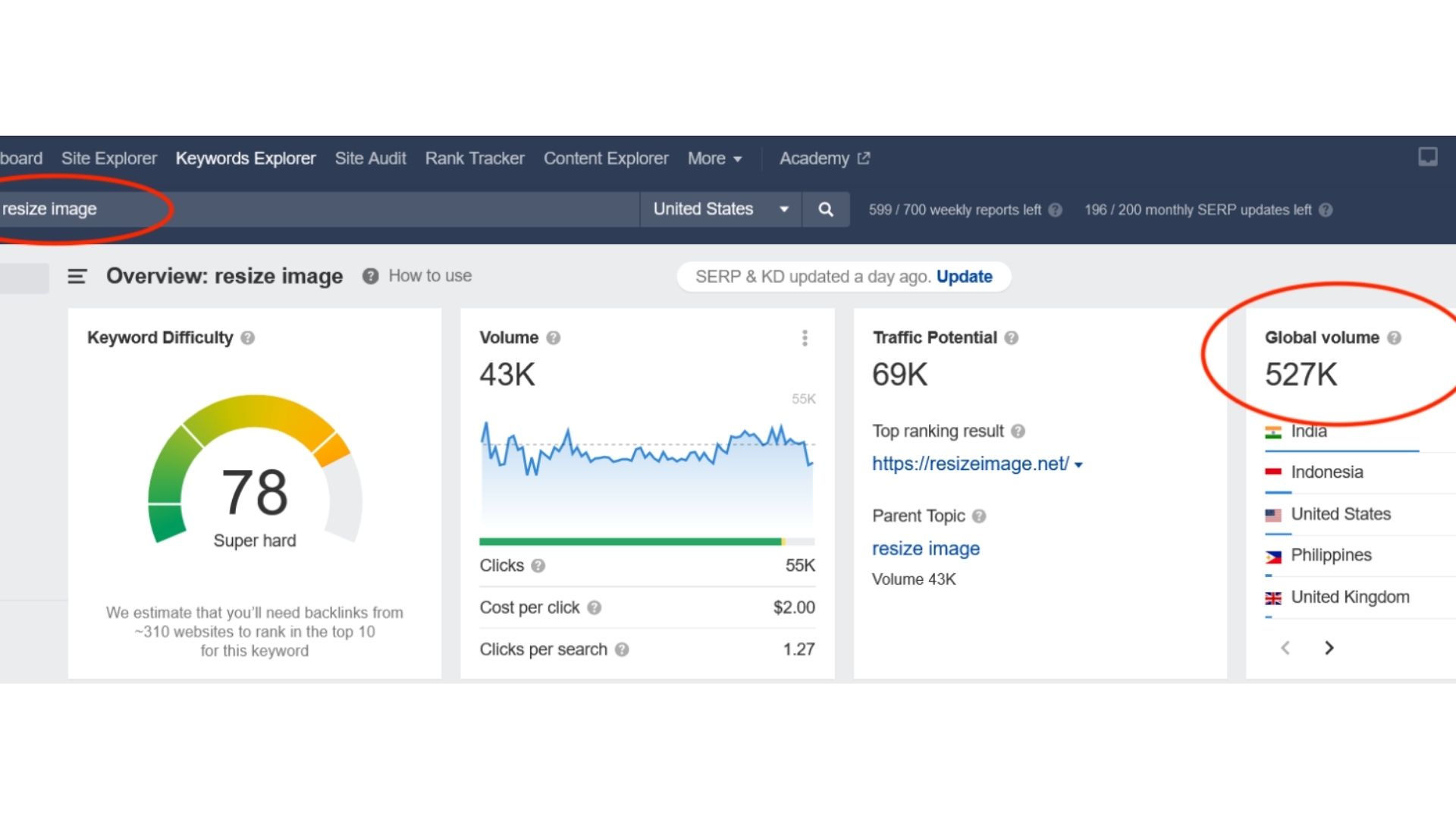
On doing a deep dive, the team realised that most of the product features have good related keywords. For instance, “Resize image” is a key feature of CC Express and the keyword of the same name has 500,000+ searches/month!

But then, why doesn’t the product page for Adobe CC Express rank for this keyword? After all, it’s a key feature of the product and there’s an entire section on it with the right keyword.
Well, the page is filled with such keywords — 30+ key features, all possibly having good keywords. So Google is unable to select a primary keyword or topic among those 30+ features. And Google just ranks the page for the parent topic i.e. "Adobe CC Express".
Got it! What did Adobe do about it then?
So the CC Express team realised that they have a goldmine of keywords. The next step was to figure out a way to create a structure and a set of pages targeting these keywords.
One page for one feature
They created an individual page for each feature.
This is how a feature page looks:
- It starts with a brief intro about the feature, including a link to the product i.e. CTA or call-to-action.

- This is followed by steps on how to use the feature.

- Three or more sections describing what you can do with the feature, peppered with CTAs.

- A section just having the CTA OR linking to the product.

Of course all through the text, Adobe has smartly infused the keyword along with CTAs.
Uniform URL structure
But here’s the more interesting part. All of these features pages have the same URL structure — /<
Examples:
- /express/feature/video/crop
- /express/feature/video/trim
Why, you ask?
- It makes it easy for Google to travel through all of these pages, and make sense that all these pages are somehow linked to the original product page i.e. /express.
- There’s an easy way to interlink all of these related pages.
- If the individual feature pages rank well, the top-level page i.e. /express also gets to benefit from it.
Common template
But that’s not all. As we saw above, Adobe used the same template for each of its feature pages.
Why?
- Helps Google figure out that these feature pages are related since they have the same theme.
- Makes it easy for Adobe to keep creating new feature pages.
And what was the impact?
Brace yourselves for the numbers!
Ahrefs shows the combined monthly traffic for all CC Express pages ('/express') to be 15.6M.
And the feature pages ('/express/feature/') alone bring in 7.5M monthly traffic!
It's impressive to see ~50% of traffic coming in from a simple yet smart SEO strategy 😎


