Remember those long hard days when you'd hire a designer to create a simple poster? When creating videos meant dealing with expensive software, which were difficult to learn and even more difficult to use.
Ah, the struggle was real. But today, things have changed. We now have so many design tools that are readily accessible and easy to use. But nothing truly compares to the OG Canva.
Canva is a simple design tool created for non-designers. Since its inception in 2013, it quickly grew to a valuation of $40 billion. It now has 60 million monthly users - all thanks to its brilliant marketing strategy.
This article is a masterclass in SEO - narrated with the example of Canva. Read on!
Tell me more about Canva's SEO success
If you look at Ahrefs,
- Canva gets 73.2 million monthly organic traffic,
- ranks for 5.5 million organic keywords and,
- has over 12 million backlinks.
That's simply amazing!
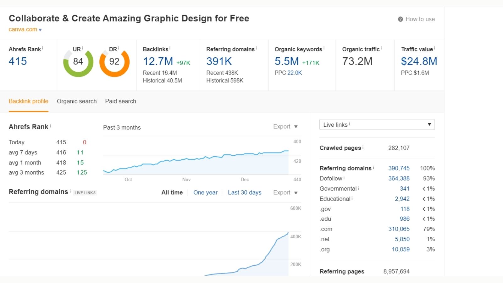
Let's break down Canva's numbers and find out how it grew organically.
SEO is one of the most reliable marketing channels. Billions of people search on Google each day. So, implementing SEO properly will direct at least a small sum of that traffic to your website. You definitely want that!
Let's investigate Canva's top sub-folders
Sub-folders are basically sub-parts of your website. They are usually landing pages. Different types of pages are then organized under these sub-folders (I talk more about this later).
Canva's sub-folders that perform exceptionally well are:
- www.canva.com/create/ - 3.3 Million Traffic
- www.canva.com/templates/ - 1.2 Million Traffic
- www.canva.com/colors/ - 1.5 Million Traffic
- https://www.canva.com/graphs/ - 348k Traffic
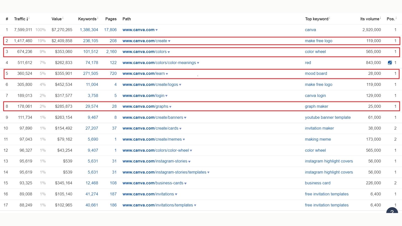
To understand why these sub-folders were created and why they perform so well, we need to first learn an important concept in SEO -- search intent.
What is search intent and why is it important?
Put simply, search intent tells you the intention behind a particular search query.
There are 4 types of intent:
- Informational - User wants to gain information about something (eg - "What is Discord?")
- Navigational - User wants to navigate to a different page (eg - "amazon.com")
- Commercial - User is looking for information with an intent to buy a product. (eg - "best washing machines")
- Transactional - User wants to buy or download something (eg - "Apple iPhone 13 128 GB")
The keyword entered by the user reflects the intention behind their search. So it is very important to design your page such that it aligns with the search intent.
Search intent should be one of the parameters you check when doing keyword research. Ultimately, you should align the search intent of the query with your content.
Let’s explore Canva’s top sub-folders
A) /Create & /Template sub-folders based on search intent
Coming back to the landing pages, let's consider the /create and /templates page.
These pages are ranking for the following keywords.
Create → "make free logo", "making memes", "poster maker", "build resume for free", "create a flyer"
Templates → "design templates", "magazine article template", "graphic templates", "birthday card templates"
If you look closely at these keywords, you can tell the difference between their search intent.
The intent for the first set of keywords is "Informational". Users are basically looking for information about tools to make/build/create a design/poster/card.
On the other hand, for the second set, the intent is "Navigational". The user is looking to navigate to a particular template page. So they are essentially looking for birthday card templates to eventually create their own cards..
Canva, very early, recognized this difference in intent. So it designed these 2 sets of pages so it ranks for both types of keywords.
For example, you'll find both /create/logo page and /logos/templates pages for the "logos" category.
B) /Colors sub-folder
In the last couple of years, Canva has evolved from being a simple design tool to becoming a holistic platform for all design needs.
One such sub-folder that contributes tremendously to this is the /colors sub-folder. The /colors landing page mainly has 4 sets of pages
- Color Wheel
- Color palette generator
- Color palette ideas
- Color meanings
Here, specifically, the /colors/color-meanings page is very interesting. The page essentially lists all the basic colors. When you click on one of these colors, it takes you to a dedicated page for that color.
So, for example, /colors/color-meanings/gold is one such page. What's incredible about these sets of pages is how good they are for SEO.
Overall, the /colors subfolder brings in 1.7M monthly traffic.
When you look at the top pages under the colors sub-folder, you'll see these pages ranking for keywords like 'color wheel', 'gold', 'sage green', 'navy blue', 'maroon', 'green', etc. So, Canva has literally captured a bunch of color keywords.
Each of these keywords has a volume of over 50K. So, Canva definitely hit a home run when it comes to these pages!
C) /Graphs sub-folder
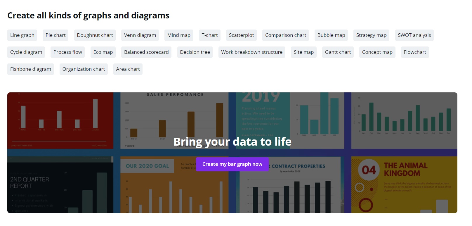
Finally, another major use case of Canva, is that you can create graphs with it. So, of course, there is a dedicated folder for that as well.
This sub-folder brings in 300K+ traffic and covers another set of keywords like:
- graph maker ➝ 26K volume
- make a family tree ➝ 19K volume
- chart maker ➝16K volume
- venn diagram ➝ 102K volume
So, when it comes to SEO, Canva has not left any stone unturned!
What about their website structure and internal linking?
But that's not it. Canva goes a step further to capture and rank for even the most niche keywords.
For instance, let's take our previous example of the /logos/templates page. On the page, you'll see a list of filters and subcategories that helps you optimize your search.
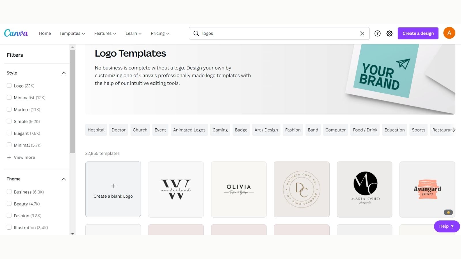
In the long list, suppose we click on the "Band" option, you'll be directed to the page /logos/templates/band. Similarly, if you click on any other option you'll be directed to that page. So the main page links to all the sub-category pages.
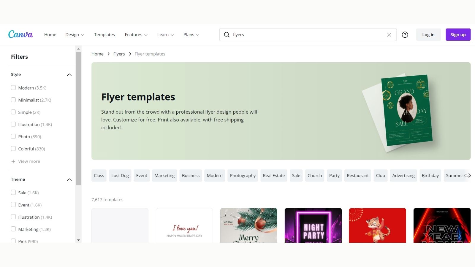
Let's take another example. The /flyers/templates page has 43 subcategories that include terms like "Thanksgiving", "Christmas", "Talent Show", "Dog Walker", etc.
All these subcategory pages (eg. Marketing flyers) get an internal link from the main category page (Flyer), that already has a high authority. So in turn due to the internal linking, the authority flows to these pages as well.
So while the flyers page ranks for more general keywords like "flyer" (Volume - 250,000), the marketing flyers template page ranks for more niche keywords like "marketing flyer template" (Volume - 250).
So the hierarchy for template pages looks like this:
- Main Template Page ➝ 1.2M Volume
- Flyers Template Page ➝ 250K Volume
- Marketing Flyers Template Page ➝ 250 Volume
But, why go through the trouble of linking all these pages?
Internal linking is a key, yet extremely underrated SEO tactic. It helps because:
- Google tracks all links to your page to determine the value of your content. The more the links, the more is your page's authority.
- Getting a link from a high authority page on your website can boost the authority of that pages. Think of it like SEO or authority juice flowing from the top page to all other pages on your website.
Internal linking in the /graphs sub-folder
The focus on internal linking can be seen across sub-folders.
For instance, the graphs landing page links to all the different types of graphs & charts pages. So, when you click on the "Bar Graph" widget on the graph page, you land from the "/graphs" page to the "/graphs/bar-graphs" page.
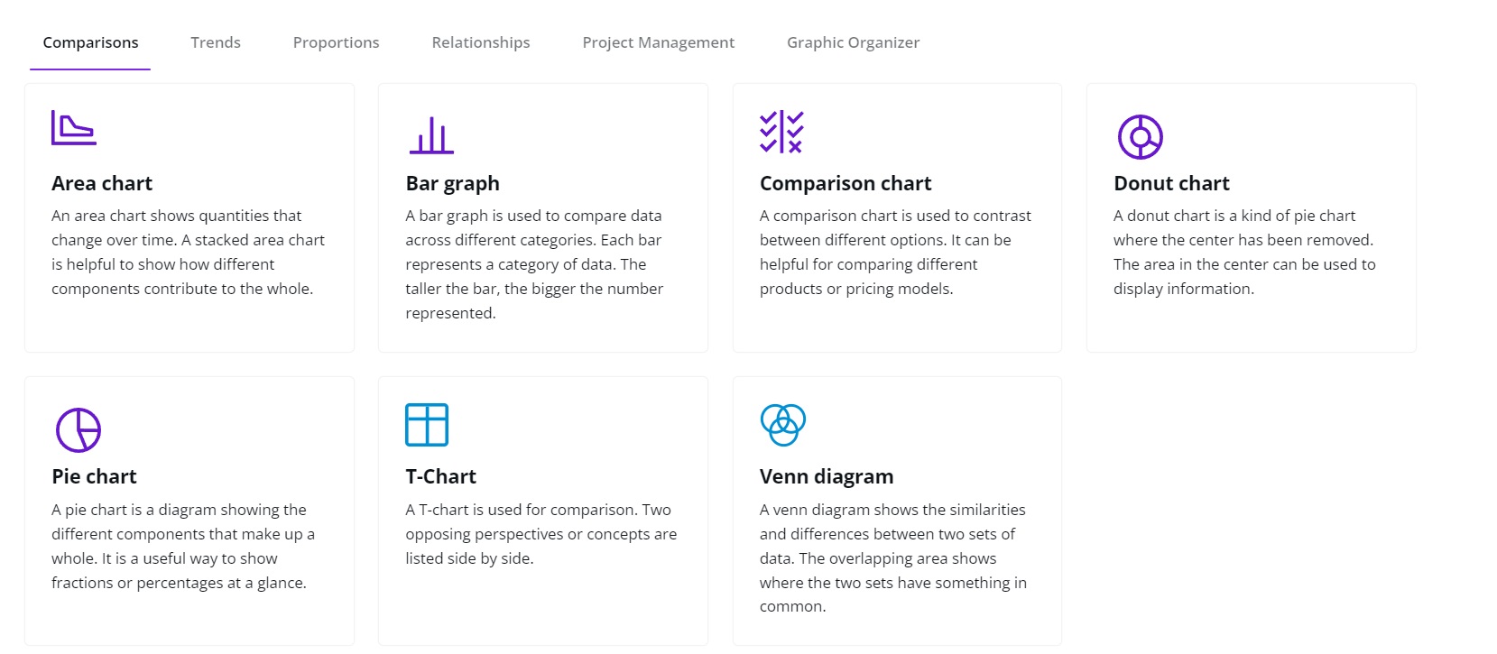
Now, the bar graphs page also links to all the graphs and charts pages. So, overall this forms an internally linked criss-cross network, where all graphs pages are linking to the other graphs pages as well! Pretty neat, right!
Wait, but did Canva do any of this at scale?
Now that we have looked at how the website pages and URLs are structured, let's look at the content on these pages.
Firstly, let's look at the page structure.
Flyers Template Page → /flyers/templates
Flyers Subcategory Pages →
1) /flyer/templates/class
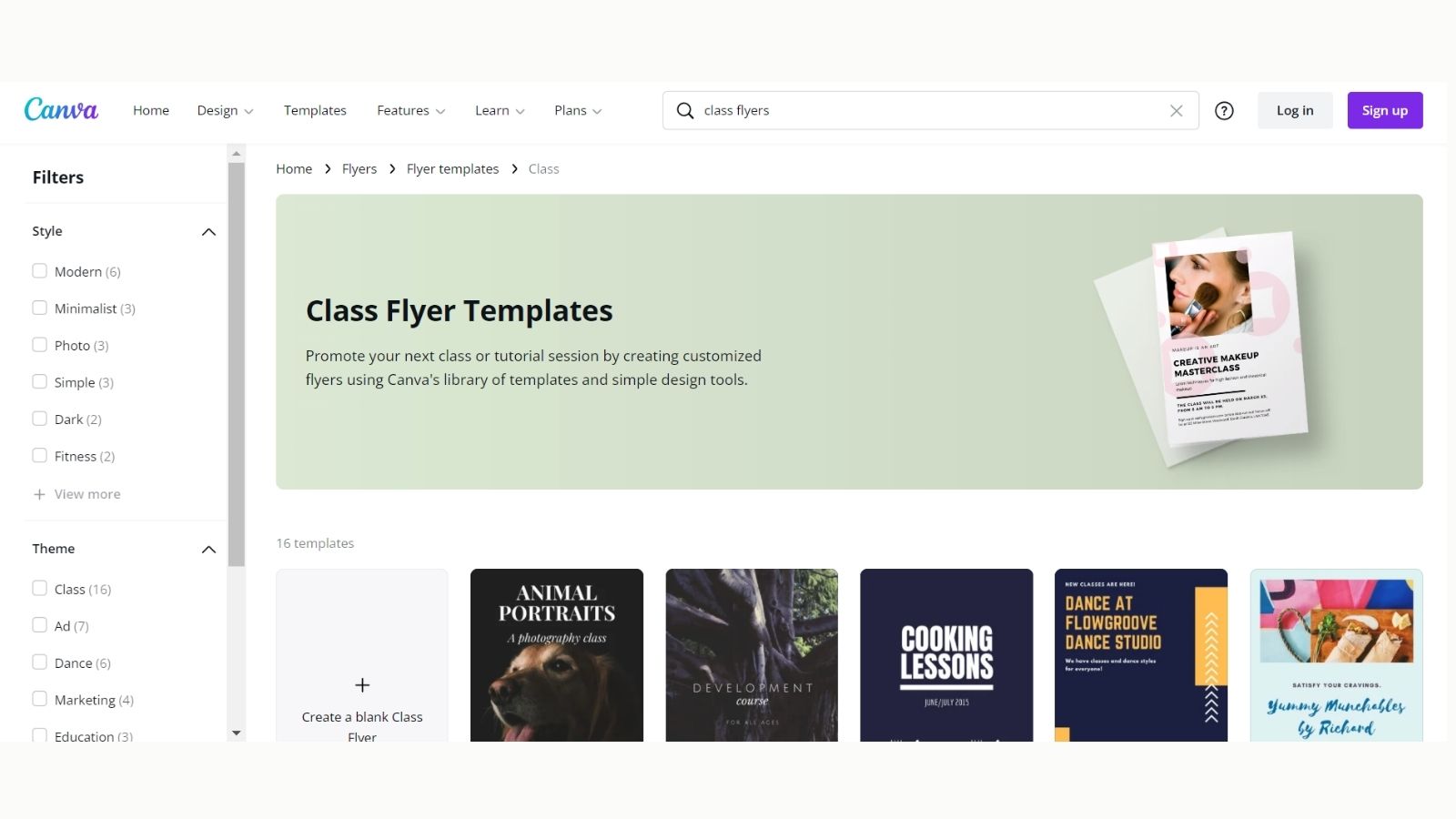
2) /flyer/templates/marketing
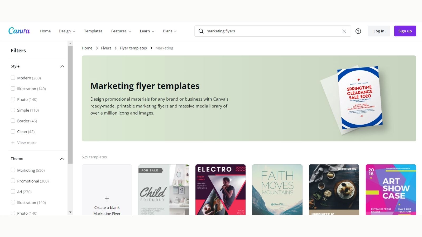
3) /flyer/templates/photography
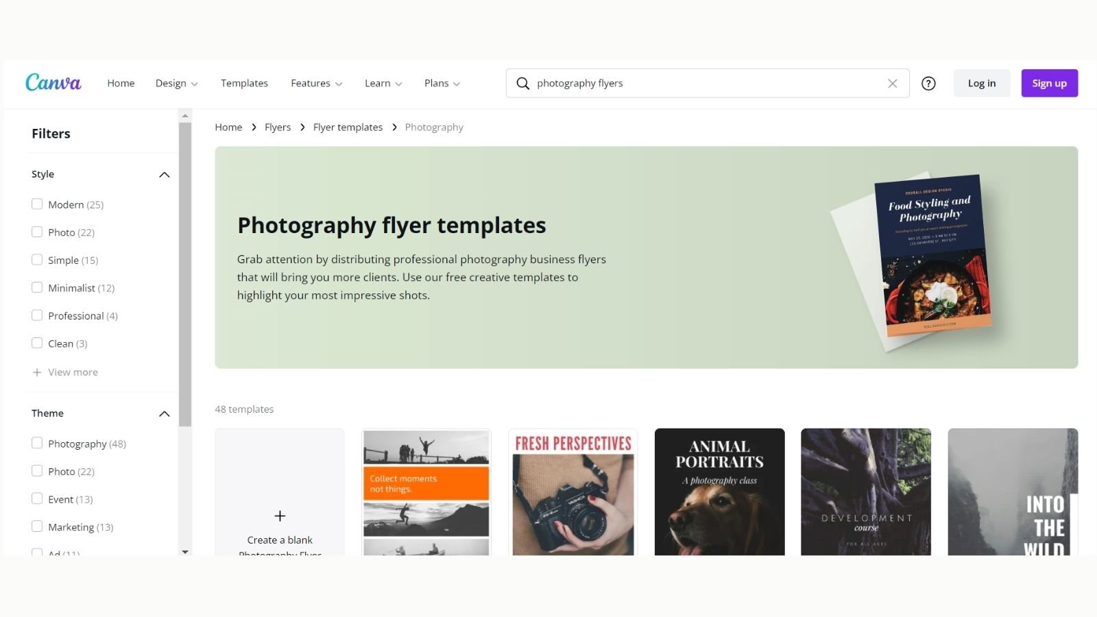
You'll quickly notice that the design of these pages is exactly the same. The only part that changes is the keyword in the H1, H2, CTA, Body, Text, etc.
This kind of common template essentially helps to create scalable pages quickly targeting niche keywords.
So what are the key takeaways from all of this?
Here's what we can learn from Canva's brilliant SEO strategy
- Search intent is extremely important in SEO. So, before you go ahead to design a page targeting a keyword, you should understand what intent are you targeting
- Organise your site such that all pages are internally linked properly. This will help even your most niche pages to rank for some keywords.
- Create templates so that adding new pages to the website is easy & scalable.


