B2B visitors arrive with a goal, and they judge your page before they even settle in. They want fast clarity, not a puzzle.
A homepage or landing page has to earn attention by making the offer obvious the moment it loads. That means no vague headlines, no scattered layout, and no extra steps before someone can understand what you do.
A strong page guides the eye without forcing effort. It gives visitors a short path to the essentials: the problem you solve, the group you serve, and the outcome they can expect. When those elements land right away, people feel grounded and far more willing to keep reading.
This article covers specific design decisions that eliminate confusion fast. We’ll skip the theory and focus on what actually works when you’ve got seconds to convince someone you’re worth their time.
Illustrate Your Offer’s Process Briefly (Even if It’s Overly Simplified)
B2B buyers want to know what happens after they say yes. The problem is, most companies either skip the process entirely or drown visitors in operational details that don’t matter yet. Neither approach works.
A simplified process visualization does two things: it proves you have a system, and it reduces the perceived risk of working with you. When someone sees “Step 1 → Step 2 → Step 3,” their brain registers structure and predictability. That’s reassuring when they’re evaluating whether to trust you with their budget.
Don’t worry about oversimplifying. Decision-makers understand you’re showing them a high-level view, not documenting every internal workflow. They’re looking for reassurance that you know what you’re doing, not a detailed operations manual.
Here’s how to execute this the right way:
Limit your process to three to five steps maximum.
Use clear, action-oriented headings for each step, not jargon or creative copy.
Pair each step with a simple icon or visual that reinforces the point without requiring interpretation.
Keep descriptions to one or two sentences.
Place this section high on your homepage, ideally right after your value proposition.
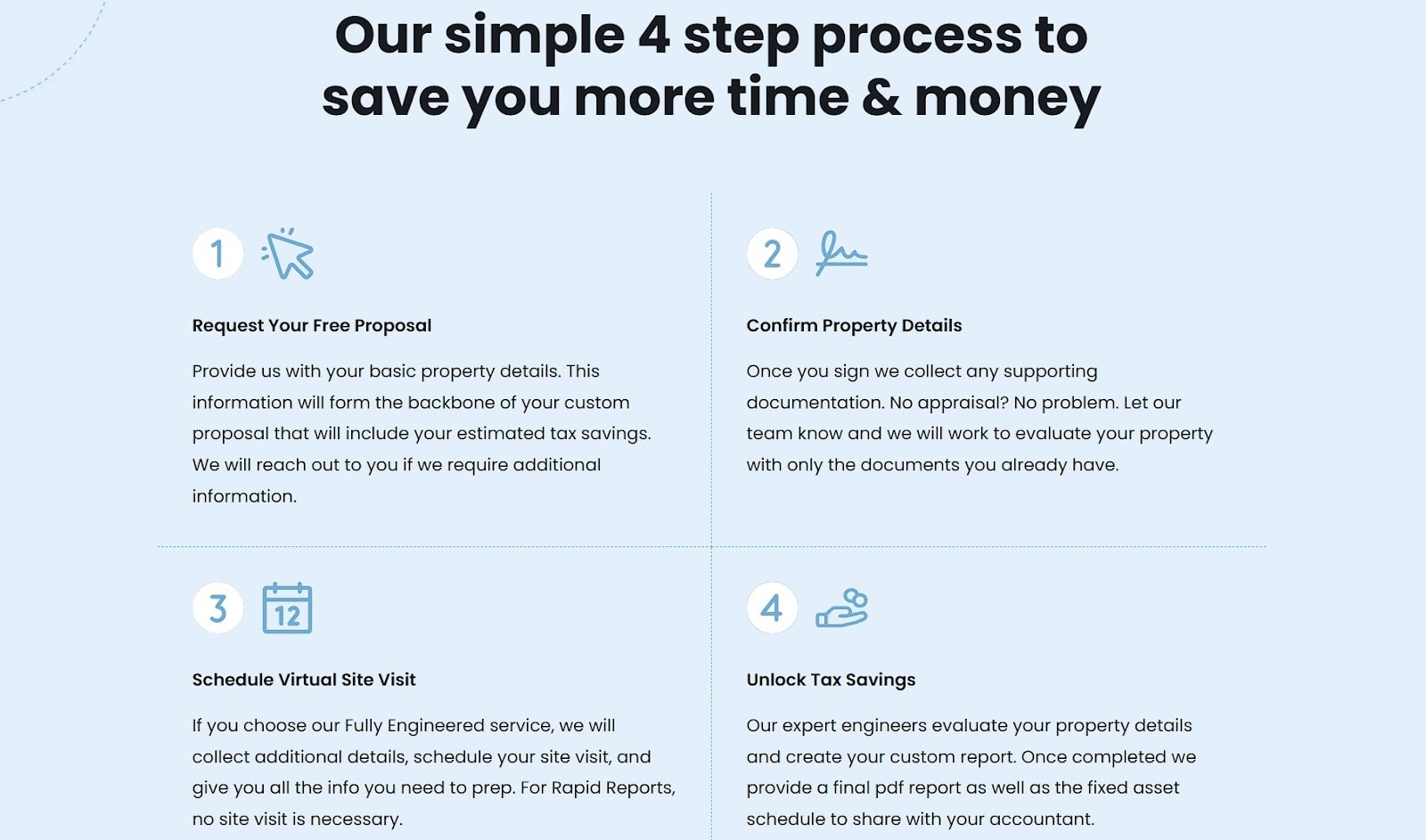
A brand that nails this approach is R.E. Cost Seg, which provides cost segregation studies for real estate investors. Their homepage features a four-step process section that explains exactly how their service works.
Each step has a concise heading, a brief description, and an icon that visually represents the action. You don’t need to understand cost segregation to follow their process.
They’ve removed the mystery without getting bogged down in technical details, which makes the decision to reach out feel less risky.
Write Extremely Customer-Centric Homepage Copy
Most B2B homepages read like internal product briefs. They’re packed with features, technical specifications, and company achievements that mean nothing to someone trying to figure out if you can solve their problem.
This happens because companies write from their perspective, not their customers’.
Customer-centric copy flips this. It starts with the visitor’s pain point and immediately connects your offer to their desired outcome. This works because people want to know what changes for them, not what your product does behind the scenes.
Here’s how to get this right:
Replace every feature statement with an outcome statement.
Instead of “Advanced analytics dashboard,” write “See which campaigns drive revenue, not just clicks.”
Cut any sentence that starts with “We offer” or “Our platform includes.”
Lead with the transformation your customers experience, then briefly mention how you deliver it, not the other way around.
Use “you” and “your” more than “we” and “our.”
Every headline should answer: “What do I get from this?”
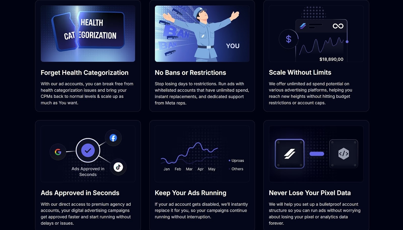
Uproas, which sells premium agency advertising accounts for platforms like Meta, Google, and TikTok, demonstrates how this works.
Their homepage copy focuses entirely on what customers gain: better ad performance, account stability, and growth outcomes. When they list service benefits, they’re specific about results rather than features.
The copy stays tight and direct. There are no vague promises or technical detours. You immediately understand what you’ll get and why it matters to your advertising results.
They’ve eliminated the guesswork by centering everything around customer outcomes rather than operational details.
Don’t Overdo Pricing Option Complexity
Complicated pricing tables kill conversions. When visitors face too many tiers, endless feature comparisons, or unclear distinctions between plans, they defer the decision. That deferral usually means they leave and never come back.
Simplified pricing removes friction. When someone can quickly identify which tier fits their needs, they move forward instead of getting stuck in analysis paralysis.
Many brands see conversion rates rise by nearly 50% when they present pricing in a concise, obvious way. That’s because they’ve eliminated the mental work required to make a choice.
Here’s how to simplify without dumbing down:
Limit yourself to three or four tiers maximum.
Name each tier based on customer type or use case, not arbitrary labels like “Basic” or “Plus.”
Highlight one or two key differentiators per tier. That’s usually the features that actually determine which plan someone needs.
List shared features separately so that you’re not repeating them across every column.
Use visual hierarchy to guide people toward the most popular option.
If your pricing structure genuinely requires complexity, move detailed comparisons to a separate page and keep your homepage view clean.
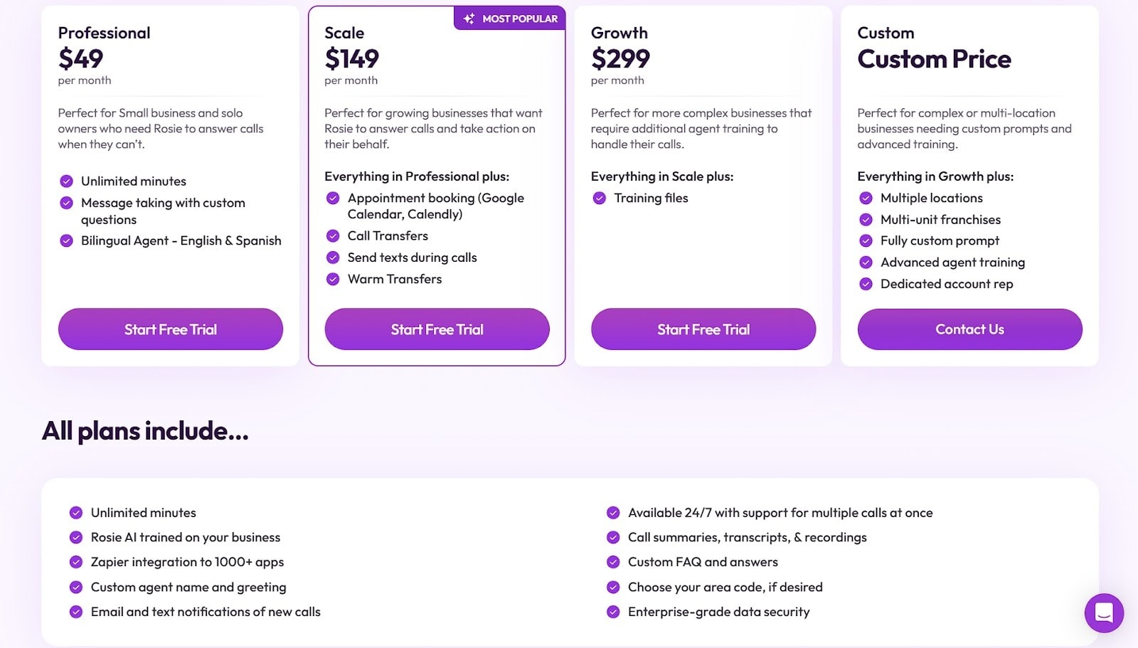
Rosie, an AI-powered phone answering service for businesses, handles this well. They offer four pricing tiers with different features and capabilities, but their homepage presentation stays clean.
Each plan gets a concise explanation with the UI making key details easy to spot. The copy stays brief and clear. They’ve pulled shared features into their own section, which eliminates redundancy across the pricing columns.
This way, you can scan their plans and identify your fit within seconds. That’s the power of prioritizing clarity over comprehensive feature lists.
Create Segment-Specific Landing Pages
Generic messaging forces visitors to translate your offer into their context. That translation takes mental effort, and in those 10 seconds you have, effort equals abandonment.
When someone from healthcare lands on a page written for retail, they’re gone before they read your “versatile solution” message.
Segment-specific pages eliminate this translation work. When visitors see their industry, role, or use case reflected immediately, recognition happens instantly. They don’t need to imagine how your offer applies to them. You’ve already shown them.
Here’s how to build these pages:
Select your three to five most common customer segments.
Create dedicated landing pages for each, using language and examples specific to that segment.
Replace generic benefit statements with outcomes that matter to that particular audience.
Include case studies or testimonials from similar customers.
Use imagery that reflects their industry or context.
Link to these pages prominently from your homepage navigation or a dedicated section that lets visitors self-select their segment.
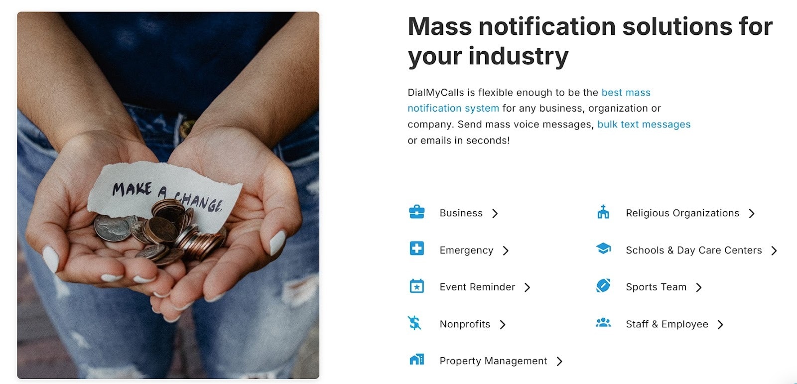
DialMyCalls, a mass texting service for organizations, executes this strategy thoroughly. They’ve built separate landing pages for different business types that use their platform: schools, nonprofits, healthcare facilities, and more.
Each page explains how their service applies to that specific sector and what benefits matter most to those users.
Their homepage includes a section showcasing these different business categories, with direct links to each tailored landing page. When a school administrator clicks through, they see content written specifically for education contexts, not generic communication platform messaging.
Remove Visual Noise to Guide the Eye to the Core Message
Every element on your page competes for attention.
When you pack your homepage with competing visuals, multiple CTAs, busy backgrounds, and dense text blocks, nothing stands out. Visitors can’t figure out where to look first, so they process nothing effectively.
Strategic use of white space directs focus. When you strip away unnecessary elements and give your core message room to breathe, comprehension improves dramatically.
Studies show that white space can boost comprehension by up to 20%. That’s because reduced visual clutter means reduced cognitive load.
Here’s how to clean up your design:
Limit yourself to one primary CTA per screen section.
Remove decorative elements that don’t support your messages.
Use whitespace generously around headlines and key information.
Stick to one or two font weights and sizes per section.
Avoid background patterns or images that compete with text readability.
If something doesn’t actively help communicate your offer or guide visitors toward conversion, cut it.
When the layout stays simple and intentional, visitors absorb information faster and feel more confident in their next step.
Prioritize Page-Load Speed
Speed affects more than user experience. It directly impacts whether visitors stay long enough to understand your offer.
When pages load slowly, people leave before they see anything. You can’t communicate value in 10 seconds if your site takes 8 seconds to render.
A one-second increase in page load time can reduce conversions by up to 7%. Slow sites signal low quality or outdated technology, which undermines trust before visitors read a single word.
Here’s how to optimize load times:
Compress all images before uploading them.
Aim for under 200KB per image without sacrificing visible quality.
Minimize the number of fonts you load, and stick to system fonts when possible.
Reduce third-party scripts and tracking tools that bog down performance.
Enable browser caching so returning visitors load faster.
Use lazy loading for images below the fold.
Test your site speed regularly with tools like PageSpeed Insights and address the specific issues they flag.
Host videos externally rather than embedding large files directly on your pages.
When your pages feel quick and responsive, leads stay longer and move through the site with less hesitation.
Final Thoughts
Strong design choices help B2B visitors understand your offer fast, but the real advantage comes from treating clarity as a habit rather than a one-time fix.
When your messaging, layout, visuals, and structure all support quick comprehension, visitors feel steady from the start. They recognize the value, know who the offer is for, and don’t need to decode anything.
These tactics work because they respect how people evaluate a page in the first few seconds. With consistent refinement, your site becomes an easier place to navigate and a stronger driver of qualified interest.


 Entrepreneurship